

Table of Contents
Introduction
Colour theory plays a crucial role in web design, influencing user experience and engagement. It encompasses the principles and guidelines that govern the use of colour in visual compositions. Understanding colour relationships, such as complementary, analogous, and triadic schemes, allows designers to create harmonious and aesthetically pleasing interfaces. Effective colour choices can evoke emotions, convey messages, and guide user actions. By applying colour theory, designers can enhance brand identity and improve usability, leading to a more effective website. Resources such as the Colour Matters website provide valuable insights into the psychological effects of colour and its application in design.
Understanding Colour Theory Basics
Colour theory serves as a foundational element in web design, guiding designers in their selection and application of colours. It encompasses the study of how colours interact and the psychological effects they can elicit. By mastering the principles of colour relationships, designers can create visually appealing and effective websites.
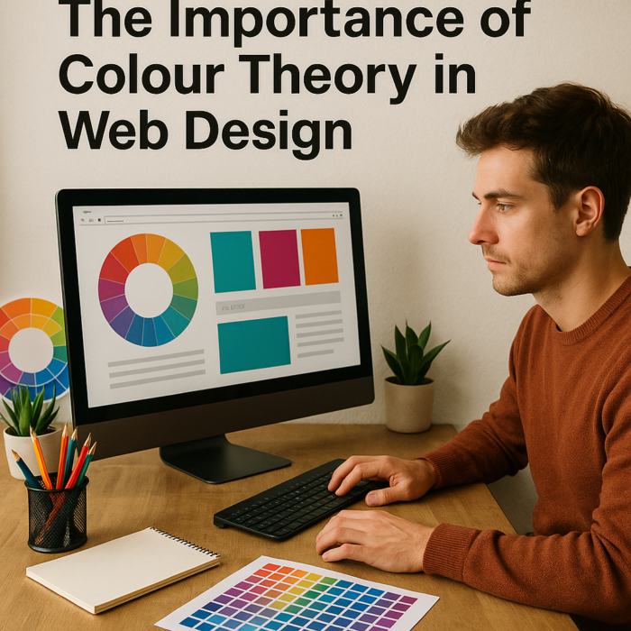
Complementary colours, which are opposite each other on the colour wheel, can create high contrast and draw attention to specific elements. Conversely, analogous colours, which sit next to each other, provide a more harmonious and cohesive look. Triadic colour schemes, involving three evenly spaced colours on the wheel, offer a balanced yet vibrant palette that can enhance user engagement.
Understanding the emotional impact of colours is also vital. For instance, blue often conveys trust and professionalism, making it a popular choice for corporate websites. In contrast, red can evoke excitement and urgency, frequently utilised in call-to-action buttons. By strategically employing colour theory, designers can effectively communicate brand identity and influence user behaviour.
A solid grasp of colour theory is essential for creating effective web designs. It not only enhances aesthetic appeal but also significantly impacts user experience and engagement.
The Psychological Impact of Colour
Colour significantly influences human behaviour and perception, making it a vital aspect of web design. Different hues can evoke specific emotions and reactions, which designers must consider when creating a website. For instance, blue often conveys trust and reliability, making it a popular choice for corporate websites. In contrast, red can evoke excitement or urgency, frequently used in sales promotions or calls to action.
Understanding the psychological impact of colour can enhance user engagement. Warm colours, such as reds and oranges, tend to attract attention and create a sense of warmth. These colours can stimulate appetite, which is why many food-related websites utilise them. Conversely, cool colours like greens and blues promote calmness and relaxation, making them suitable for health and wellness sites.
The cultural context of colour must also be taken into account. Different cultures may interpret colours in various ways, which can affect how a website is perceived globally. For example, while white is associated with purity in Western cultures, it may represent mourning in some Eastern cultures. Designers should conduct thorough research to ensure that their colour choices resonate positively with their target audience.
Colour Harmony and Its Role in Design
Colour harmony is essential in web design, influencing both aesthetic appeal and functionality. Designers create a cohesive visual experience that guides users by selecting complementary colours that work together harmoniously. This principle enhances user engagement, as visitors prefer visually appealing and easy-to-navigate sites. A well-designed colour palette can also evoke specific emotions, further enhancing the user experience and encouraging interaction with the content.
Methods to achieve colour harmony include colour schemes such as complementary, analogous, and triadic. Complementary colours, opposite each other on the colour wheel, create vibrant contrasts that highlight specific elements. Analogous colours, adjacent on the wheel, offer a subtle effect suitable for backgrounds. Triadic schemes consist of three evenly spaced colours, providing a balanced yet dynamic look. Each of these schemes can be tailored to suit the brand’s identity and the target audience’s preferences.
Incorporating colour harmony enhances a website’s visual appeal and conveys the intended message. For instance, a health-related site may use calming blues and greens to promote tranquillity and trust. By applying colour harmony principles, designers create engaging web experiences that resonate with users. This thoughtful approach not only attracts visitors but also encourages them to return, fostering loyalty and enhancing the site’s effectiveness.
The Use of Colour in Branding
Colour plays a pivotal role in branding, serving as a visual identifier that distinguishes a company from its competitors. The strategic use of colour can significantly enhance brand recognition and influence consumer perceptions. For instance, brands such as Coca-Cola utilise red to evoke feelings of excitement and energy, while Facebook employs blue to convey trust and security.
When selecting colours for branding, designers should consider the following factors:
- Target Audience: Understanding the demographics and preferences of the intended audience is crucial. Different age groups and cultures may interpret colours differently.
- Brand Personality: The chosen colours should reflect the brand’s values and personality. For example, a luxury brand may opt for black and gold to signify sophistication.
- Industry Standards: Certain industries have established colour conventions. For instance, green is often associated with health and wellness, making it a popular choice for organic products.
Consistency in colour usage across various platforms reinforces brand identity. A coherent colour palette enhances visual recognition, ensuring that consumers can easily identify the brand in diverse contexts, from websites to social media profiles.
The Role of Colour in Emotional Connection
Colour not only aids in recognition but also fosters emotional connections with consumers. By aligning colour choices with the desired emotional response, brands can create a more impactful message. For example, using warm colours can evoke feelings of comfort and warmth, while cooler tones may inspire calmness and professionalism.
The effective use of colour in branding is essential for creating a memorable and engaging user experience. By understanding the psychological implications and cultural associations of colours, designers can craft a compelling visual identity that resonates with their audience.
Accessibility Considerations in Colour Choices
Accessibility considerations in colour choices are paramount in web design. Designers must ensure that their colour selections accommodate users with varying visual abilities, including those with colour blindness or low vision. Adhering to accessibility guidelines enhances user experience and broadens the audience reach, fostering a more inclusive digital environment.
Understanding Colour Accessibility
Colour accessibility involves creating designs that are perceivable by all users, regardless of their visual capabilities. The Web Content Accessibility Guidelines (WCAG) provide a framework for achieving this goal. Key aspects include:
- Contrast Ratio: Ensure sufficient contrast between text and background colours. A minimum ratio of 4.5:1 for normal text and 3:1 for large text is recommended.
- Colour Combinations: Avoid using colour as the sole means of conveying information. For example, include text labels alongside colour-coded elements to enhance clarity.
- Testing Tools: Utilise online tools, such as the WebAIM Contrast Checker, to evaluate colour combinations for accessibility. Regular testing can help identify potential issues.
Choosing Inclusive Colour Palettes
Designers should select colour palettes that consider the needs of all users. The following strategies can enhance inclusivity:
- Use of Patterns and Textures: Incorporate patterns or textures alongside colour to differentiate elements, providing additional context for users.
- Neutral Colours: Employ neutral colours alongside vibrant hues to create a balanced visual hierarchy, ensuring that important information stands out.
- Colour Blindness Simulators: Use simulators to preview how designs appear to individuals with colour vision deficiencies. This practice can inform better design choices.
By prioritising accessibility in colour choices, designers can create websites that are not only visually appealing but also functional for a diverse audience. This commitment to inclusivity

Cultural Significance of Colours
Colours carry profound cultural significance, influencing perceptions and behaviours across different societies. Each colour often embodies specific meanings that can vary widely from one culture to another. For instance, in Western cultures, white traditionally signifies purity and peace, frequently associated with weddings. Conversely, in some Eastern cultures, white is linked to mourning and death, illustrating how context shapes colour interpretation.
Red, a colour that evokes strong emotions, can represent love and passion in many cultures, while in others, it may signify danger or warning. In China, red is a symbol of good fortune and joy, often used in celebrations and important ceremonies. This divergence in meaning underscores the necessity for designers to consider their target audience’s cultural context when selecting colours for a website.
Green is another colour with varied interpretations. In many cultures, it represents nature, growth, and fertility. However, in some contexts, it can also be associated with jealousy or inexperience. Designers must remain cognisant of these associations to ensure that their colour choices resonate positively with their audience.
The implications of colour extend beyond mere aesthetics; they can significantly affect user engagement and brand perception. Understanding the cultural significance of colours enables designers to create more effective and relatable designs. By aligning colour choices with cultural meanings, designers can foster a deeper connection with users, enhancing the user experience.
The cultural significance of colours plays a vital role in web design. Designers should strive to understand the cultural contexts of their audience to make informed colour choices that not only enhance aesthetic appeal but also resonate meaningfully with users.
Practical Applications of Colour Theory in Web Design
Colour theory finds numerous practical applications in web design, enhancing both aesthetics and functionality. Designers leverage colour principles to create visually appealing websites that engage users effectively. The following sections outline key applications of colour theory in this context.
Creating Visual Hierarchy
Establishing a clear visual hierarchy is essential for guiding users through a website. Colour can effectively differentiate between various elements, such as headings, subheadings, and body text. By using contrasting colours for primary and secondary elements, designers can draw attention to important information and facilitate navigation. For example, a vibrant colour for call-to-action buttons can encourage user interaction, while a muted palette for background elements ensures a clean and organised appearance.
Enhancing User Experience
The strategic use of colour contributes significantly to user experience. Designers can create a sense of comfort and familiarity by employing a consistent colour palette throughout a website. This consistency helps users navigate the site with ease, as they can quickly identify functional elements. Colour can evoke specific emotions, enhancing the experience. For instance, warm colours may create a welcoming atmosphere, while cooler tones can establish a sense of calm.
Influencing Conversion Rates
Colour choices can directly impact conversion rates on e-commerce websites. Research indicates that certain colours can prompt users to complete desired actions, such as making a purchase or signing up for a newsletter. For example, the use of green in buttons often signifies a positive action, such as “buy now” or “subscribe.” Brands like Amazon utilise colour strategically to guide users towards making purchases, demonstrating the importance of colour in driving sales.
Establishing Brand Identity
Colour plays a crucial role in establishing and reinforcing brand identity. A well-defined colour palette can communicate a brand’s values and personality. For instance, the use of blue by Facebook conveys trust and reliability, while the vibrant red of Coca-Cola evokes excitement and energy. Consistent application of brand colours across various platforms fosters recognition and strengthens brand loyalty.
Adapting to Cultural Contexts
Designers must consider cultural contexts when selecting colours, as meanings can vary significantly across different societies. For example, while white is associated with purity in Western cultures, it may signify mourning in some Eastern cultures. Understanding these nuances allows designers to create culturally sensitive websites that resonate with diverse audiences. By tailoring colour choices to specific cultural contexts, designers can enhance user engagement and foster inclusivity.
The practical applications of colour theory in web design are extensive. From creating visual hierarchy to influencing conversion rates, colour choices significantly impact user experience and brand identity. By utilising colour effectively, designers can create websites that not only attract visitors but also encourage interaction and engagement.
Tools and Resources for Colour Selection
When selecting colours for web design, various tools and resources can facilitate the decision-making process. Colour selection tools assist designers in identifying suitable colour palettes that align with their vision and objectives. For instance, Coolors offers a user-friendly interface that generates colour schemes based on user preferences. This tool allows designers to explore different combinations and find the perfect palette for their projects, ensuring that the selected colours complement each other effectively.
Another valuable resource is Adobe Color, which enables users to create and save colour themes. This platform provides options for generating complementary, analogous, and triadic colour schemes, making it easier to achieve harmony in design. Designers can also explore trending colour palettes and gain inspiration from the community, which helps to stay current with design trends and user preferences.
For those seeking to understand colour psychology in greater depth, Color Psychology offers insights into how different colours affect emotions and behaviours. This resource can guide designers in making informed choices that resonate with their target audience, enhancing the effectiveness of their designs.
Accessibility tools are also critical in ensuring that colour choices accommodate all users. Websites such as WebAIM provide contrast checkers that help designers evaluate the visibility of text against background colours. Ensuring adequate contrast not only enhances readability but also adheres to accessibility standards, which is essential for creating inclusive digital experiences.
Incorporating these tools and resources into the design process can significantly improve the effectiveness of colour selection. By utilising these platforms, designers can create visually appealing websites that engage users while considering psychological, cultural, and accessibility factors. Thoughtful colour choices contribute to a more impactful and memorable user experience, fostering a deeper connection between the website and its audience.
Conclusion
Colour theory is a fundamental aspect of web design that significantly influences user experience and engagement. By understanding the principles of colour harmony, designers can create aesthetically pleasing websites that not only attract visitors but also facilitate navigation. A well-structured colour palette enhances the visual appeal, guiding users through the content seamlessly.
The psychological impact of colour cannot be understated. Different colours evoke distinct emotions and responses, which can affect how users perceive a brand or product. For example, warm colours like red and orange can stimulate excitement and urgency, while cooler tones such as blue and green often promote calmness and trust. Designers must carefully consider these emotional associations when selecting colours to ensure alignment with the intended message and branding.
Accessibility remains a critical consideration in colour choices. Designers must strive to create inclusive websites that cater to individuals with varying visual abilities. This involves adhering to established accessibility guidelines, ensuring that colour contrasts are sufficient for readability. By prioritising accessibility, designers not only enhance user experience but also expand their audience reach.
The cultural significance of colours varies across different societies, which designers must acknowledge. Understanding these cultural nuances can prevent misinterpretations and ensure that the website resonates positively with its intended audience. For instance, while white may symbolise purity in Western cultures, it can represent mourning in certain Eastern contexts.
Incorporating colour theory into practical applications is essential for effective web design. Tools and resources available for colour selection can aid designers in this process, allowing them to experiment with various combinations and identify the most suitable palettes for their projects. A thoughtful approach to colour theory can lead to the creation of websites that are not only visually appealing but also functionally effective and culturally sensitive.